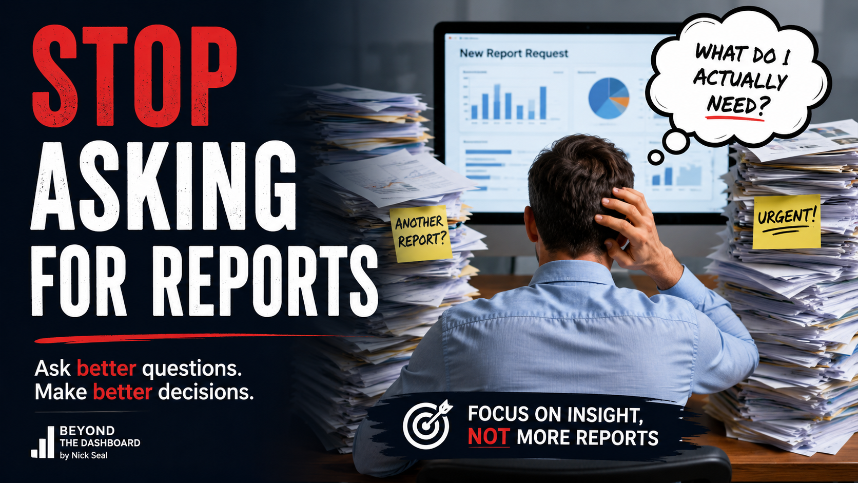
Executive summary
Every organisation says it wants better reporting.
Few actually want simpler reporting.
That might sound contradictory, but after years of designing dashboards, rebuilding semantic models and helping organisations recover from failed reporting projects, I've noticed the same pattern repeat itself.
Teams believe that adding more information automatically creates more value.
More KPIs.
More charts.
More filters.
More pages.
More colours.
More drillthroughs.
Eventually the dashboard becomes a technical achievement rather than a decision-making tool.
Ironically, the people who requested all those features often stop using it.
The most successful BI solutions I've delivered have almost never been the most technically impressive. They were the ones that removed friction. They answered important questions quickly. They inspired confidence. They encouraged action.
Simplicity is not about removing capability.
It is about removing everything that distracts from making better decisions.
Walk into almost any organisation and you'll hear the same complaint.
"We have loads of reports."
What they usually mean is something quite different.
They have plenty of information, but very little insight.
I've seen organisations with hundreds of Power BI reports, thousands of visuals and countless measures, yet managers still export everything into Excel before making decisions. Not because Power BI isn't capable, but because the reports were built to demonstrate everything the platform could do instead of helping someone answer one important question.
That distinction matters.
People rarely complain about having too little data.
They complain about having too much of the wrong data.
Complexity is Easy. Simplicity is Designed.
Complexity doesn't usually arrive because someone planned it.
It grows gradually.
A stakeholder asks for one more KPI.
Another department wants its own page.
Someone requests another slicer "just in case".
A director asks whether last year's figures could appear alongside budgets, forecasts and rolling averages.
Each request sounds perfectly reasonable in isolation.
After six months, the report has become a collection of compromises.
No single decision caused the problem.
Thousands of tiny decisions did.
This is one of the biggest differences between experienced BI professionals and those still learning the craft.
Junior developers often measure success by how much functionality they can include.
Experienced consultants measure success by how much unnecessary complexity they can remove.
Those are very different mindsets.
One builds reports.
The other designs decisions.
I've worked on projects where the first version of a dashboard contained nearly fifty visuals spread across multiple pages.
Every chart was technically correct.
Every measure had been validated.
Every stakeholder had approved their section.
Nobody actually used it.
When we analysed usage, users spent less than thirty seconds on average before closing the report.
That wasn't because the data was wrong.
It was because people couldn't immediately identify what mattered.
The purpose of a dashboard is not to display information. It is to reduce uncertainty so that someone can make a decision with confidence.
The Cost of Too Much Information
Business intelligence projects often focus on technical performance.
Refresh times.
Storage.
Query optimisation.
Semantic models.
Incremental refresh.
These things matter.
I've spent plenty of time optimising models that reduced report load times from minutes to seconds.
But technical performance is only half the story.
Cognitive performance matters just as much.
If a report loads in two seconds but takes someone five minutes to understand, it still isn't performing well.
Speed without clarity simply accelerates confusion.
Psychologists have understood this for decades.
Human working memory has limits.
When we ask someone to compare fifteen KPIs, interpret six different chart types, understand multiple colour scales and remember yesterday's numbers while evaluating today's, we create unnecessary mental effort.
The dashboard becomes work.
Good reporting should remove work, not create it.
One finance director once told me something that has stayed with me ever since.
"I don't need every number."
"I need the right number."
That simple statement completely changed how I approached executive reporting.
Executives rarely lack information.
They lack confidence that they are looking at the information that matters most.
Great dashboards provide that confidence.
Consider two sales dashboards.
The first contains twenty-five KPIs, fifteen charts, six maps, multiple drillthrough pages and every imaginable filter.
The second begins with one question.
Are we on target?
If the answer is yes, the user can move on with their day.
If the answer is no, the report guides them naturally towards understanding why.
Both dashboards contain the same underlying data.
Only one respects the user's time.
Every Visual Should Justify Its Existence
One of the simplest exercises I use during dashboard reviews is surprisingly uncomfortable.
I point at every visual and ask a single question.
"What decision does this help someone make?"
There is often an awkward silence.
Not because the visual is inaccurate, but because nobody has considered why it exists.
Many dashboards contain charts because someone thought they looked useful, because another report had something similar, or because removing them might upset a stakeholder.
None of those are good reasons.
A visual earns its place only when it changes behaviour, improves understanding or supports a genuine business decision.
If it does none of those things, it is decoration.
And decoration is expensive.
Not in licensing costs or infrastructure.
In attention.
Attention is the scarcest resource any dashboard has.
Every unnecessary visual steals it from something more important.
One lesson I've learned repeatedly is that users rarely ask for simplicity.
They ask for certainty.
When someone requests another KPI or another chart, what they are often saying is, "I'm worried I'll miss something important."
That is a perfectly reasonable concern.
The solution, however, is not to show everything. It is to design the report so users know where to look when something changes. Confidence comes from clear navigation and thoughtful information hierarchy, not from overwhelming people with every available metric.
Start with the Decision, Not the Dashboard
One of the first questions I ask before opening Power BI Desktop is not about data.
It's about decisions.
What decision is this report supposed to help someone make?
If nobody can answer that question clearly, there is little point discussing layouts, charts or colours.
A dashboard without a decision is simply a collection of visualisations.
A dashboard built around a decision becomes a business tool.
This small change in thinking influences every design choice that follows.
Imagine a warehouse manager arriving at work on Monday morning.
They have ten minutes before the first operational meeting.
They are not interested in exploring every metric available within the warehouse management system.
They want answers.
Which sites are behind?
Which orders are at risk?
Where should resources be redirected?
Everything else is secondary.
A successful dashboard respects that reality.
This is why the best dashboards feel almost effortless to use.
The user isn't deciding where to look.
The report has already made that decision for them.
Good design quietly removes friction.
Great design makes that friction invisible.
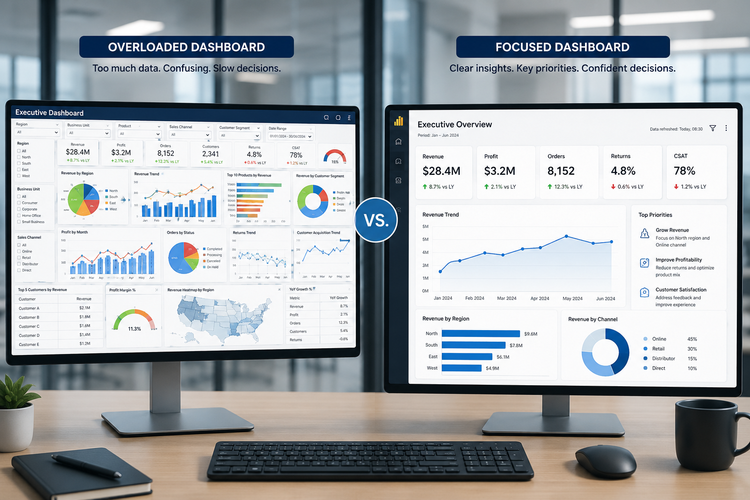
A split-screen illustration comparing two executive dashboards. The left side is cluttered with dozens of colourful charts, gauges, filters and KPIs, with a confused executive trying to interpret it. The right side shows a clean dashboard with three key metrics, a simple trend chart and a clear action panel, with the executive confidently making a decision.
Complex Dashboard
- Starts with available data
- Every stakeholder adds requirements
- Multiple competing KPIs
- Heavy use of colour
- Many chart types
- Numerous filters
- Difficult to explain
- Long training required
- Low user adoption
- Encourages exporting to Excel
Simple Dashboard
- Starts with a business decision
- Ruthlessly prioritised
- Few but meaningful KPIs
- Colour used intentionally
- Consistent visual language
- Minimal filtering
- Easy to explain
- Intuitive to navigate
- High user adoption
- Encourages confidence
Simplicity Requires More Discipline, Not Less
There is a common misconception that simple dashboards take less effort to produce.
In reality, the opposite is usually true.
It's relatively easy to place thirty visuals on a page.
It's considerably harder to identify the four that genuinely matter.
Every item removed requires confidence, experience and often difficult conversations with stakeholders.
Saying "no" professionally is an important part of every BI consultant's role.
I've occasionally been asked why a dashboard "looks too simple."
My response is always the same.
"What decision can you not make because something is missing?"
That changes the conversation immediately.
Instead of discussing appearance, we're discussing outcomes.
That is where every BI conversation should begin.
- Dashboard Simplicity
- The deliberate process of removing unnecessary information, interactions and visual elements so users can reach the right business decision with the least possible effort, while retaining the ability to investigate further when required.
Practical Ways to Simplify Every Dashboard
Principle | Why it Matters | Practical Example |
|---|---|---|
Prioritise one objective per page | Reduces cognitive load | Executive summary page focused only on organisational health |
Limit KPIs | Encourages focus | Five meaningful KPIs instead of twenty-five averages |
Use consistent colours | Builds familiarity | Green always means good, red always means attention |
Remove unnecessary visuals | Improves scanning | Delete charts that duplicate another visual |
Use progressive disclosure | Prevents overload | Summary first, detail through drillthrough |
Keep layouts predictable | Improves navigation | Filters always in the same place |
Label clearly | Removes ambiguity | "Revenue This Month" instead of "Revenue" |
Test with real users | Confirms assumptions | Observe users without explaining the report |
- Can someone understand the report within thirty seconds?
- Does every page answer one primary business question?
- Does every visual support a real decision?
- Are KPIs prioritised by importance?
- Are colours used consistently?
- Is unnecessary decoration removed?
- Are labels immediately understandable?
- Is detailed analysis available without overwhelming new users?
- Have real users tested the report?
- Would you remove anything if starting again today?
"Perfection is achieved, not when there is nothing more to add, but when there is nothing left to take away."
30 Seconds
Typical first impression window
Most users decide whether a dashboard is useful within the first half minute. If they cannot identify what matters quickly, adoption drops significantly regardless of technical quality.
Frequently asked questions
Is a simple dashboard suitable for complex businesses?
Should executives see fewer metrics than analysts?
Does simplicity mean fewer features?
What is the biggest mistake in dashboard design?
Should every report have drillthrough pages?
How many KPIs should appear on an executive dashboard?
How do I convince stakeholders to remove visuals?
Key takeaways
- Simplicity improves decision making more than additional information.
- Every dashboard should begin with a business question.
- Every visual must justify its existence.
- Cognitive performance is as important as technical performance.
- Good dashboards reduce uncertainty rather than display data.
- Progressive disclosure is better than overwhelming users.
- Consistency builds trust and confidence.
- Simplicity requires discipline, experience and stakeholder management.
- The best dashboards respect the user's time.
- If users need training to understand the first page, the design probably needs refining.